Before we begin, we want to thank everyone who helped us reach the Top 100 elearning blogs. We hope that everyone in the industry would join in the conversations and comment.
Our discussion today is all about taking it back the basics of e-Learning, back to the very first phase in the process, the design. Then, we will zoom in on the most important person in that phase, the highlight of the design document…you guessed it, the LEARNER.
Within the design document, after I define the scope of the project, one of the first items I analyze is the Audience. Specifically, the following, broken down by percentages:
- Sex
- Race
- Education
- Job role
- Technical Competency
After your audience analysis with the client, it should look something like this:
- Male 60% / Female 40%
- Caucasian 80% / Latino and African American 20%
- Some college 30% / Bachelor Degree 60% / Master Degree + 10%
- Clinical Sales Reps who spend 75% of their time in the field visiting medical facilities, demonstrating medical devices and providing support. Most of their training is done from their phone or tablet.
- Technical competency rated 5 on a scale of 1 to 5, with 1 being Low and 5 being High.
When this initial analysis is complete, we can focus on how to appeal to the learner using graphics, text, and activities, while applying the above analysis.
Let’s focus on three key learning categories in which learners can fall under; bearing in mind that not every person fits into just one category. These three categories are defined as:

Visual: Learners in this category learn better from viewing video, imagery, and text. This accounts for more than half the population.

Auditory: Learners in this category learn better by listening to lectures, podcasts, narrations (whether from e-Learning or audiobooks), and even music. Roughly 30% of the population are auditory learners.

Kinesthetic: Learners in this category learn better by doing or carrying out the activity they are attempting to learn. It is important to note that only 5% of the population are kinesthetic learners.
Next, let’s make some inferences regarding each of these categories based on our audience analysis.
Defining the Visual: When displaying visuals which include people, a balanced mix of male and female would be appropriate, with a diverse mix of ethnicities. The text should be at a 10th grade reading level based on the variety of college education levels. Graphics and videos should include references to medical equipment, medical staff, and facilities, based on the job role. And, when referencing sales staff and relevant data and guidelines, the imagery should be depicted as a business professional. The interactivity level can be high because of their technical competency. For example, case studies, games, scenarios, video analysis, etc.
Defining the Auditory: Your module should definitely include audio narration. You may even consider making an audio-only version of the course available. Intro music for title slides and even activities may also be appropriate.
Defining the Kinesthetic: Your module should include some type of interaction every 3rd slide for this learner, in order to maintain their interest. And don’t forget to include lots of hands-on creative activities. Reading the steps are not enough for this type of learner, they have to try it for themselves. If the steps include how to work a piece of medical equipment, consider having a virtual simulation of the machine created for the course, so that they can practice using it within the module. The more realistic, including sound effects and instantaneous feedback when they press an incorrect button or something similar, the better.
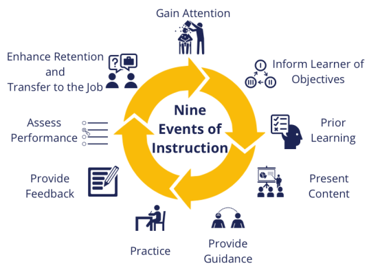
Lastly, I want to link all of the learning styles into my favorite theory, Gagne’s 9 Events. The reason why I love this theory is because it covers all types of learners and includes pre- and post-assessments, encourages interactivity, and provides feedback and guidance throughout the module.

If you want to learn more about the learning principles we incorporate into our modules, check out our About Us page where I discuss my all-time favorite learning guru, Dr. Ruth Clark. It’s all about the balance of text, proper colors, relevant graphics, and white space!
Until next time…
About the Author
Cheryl Powell is the owner of a 23-year-old virtual Training and Development company, specializing in eLearning, called Learn2Engage. For over two decades, she and her team of Consultants have helped companies move from ‘PowerPoint style’ training to fun, engaging learning materials and modules that help organizations increase productivity and satisfaction rates.
Starting out as a stand-up classroom Instructor/Trainer, Ms. Powell worked her way up to online Professor for colleges and universities, to writing curricula and training for corporations as an Instructional Designer. In 1996, she made the decision to leave Corporate America and open her own consulting firm, which has been thriving ever since.
Ms. Powell is also a successful published author of fiction, under pen name Cheryl Denise Bannerman. She now resides in Orlando, Florida, where she runs GC Learning Services LLC dba Learn2Engage, which she originally founded in New Jersey in 1996.

